

Data in Transit (#9)
New analytics blog, transit equity dashboard and surveys gone wrong

Hello!
For this year’s first newsletter, I wanted to talk about how to use data in transportation. This issue looks at data from multiple lenses: from how to do analytics in a huge system like the MTA to answering important questions of transit equity with open-source tools like GTFS. Lastly, an example of how travel surveys can go wrong and why the assumptions we bake into a model are just as important as our results.
Let’s dive in!
📈 MTA Data and Analytics Blog
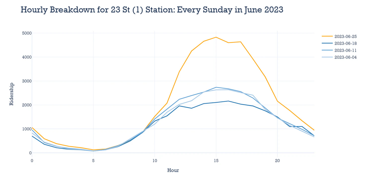
The MTA has a new data blog! If you’ve ever wondered how subway ridership changes through major events, like a Taylor Swift concert or the NYC marathon, this is the place to get those answers. “New York on the Move” explores station ridership at different points during these special events, like the NYC Pride March in June 23. According to MTA’s ridership data rides peaked on Sunday June 25th when the Parade took place:
It’s also cool to learn about what technologies data teams are using. So, one of the blog’s other posts, How we build analytics at scale at the MTA, was also an interesting read. One of the challenges of working in data science team is how to make your work reproducible. To address this, MTA has set up many processes to make modeling work be easily incorporated with the rest of the data pipelines.
🚋 Commutes, Job Access and Structural Inequality
What can we learn from people’s commuting patterns? Jeremy Ney (who also writes American Inequality) recently published an article discussing how commuting times in New York are often longer for healthcare workers and minority populations.
Inadequate public transit is one of the biggest issues in areas with lower income populations. In fact, Ney quotes this New York Times study which analyzes “supercommuters”, people whose commute is more than 90 minutes, during 2010-2019. Surprisingly, half of these people lived relatively close to their workplaces (>30 miles), which makes it harder to attribute their long commutes to sheer distance. The article finds these people were also 5x more likely to use transit rather than a car.
Commute times are also a strong predictor for upward mobility, and job access is often distributed unequally across different population groups. TransitCenter recently released their own analysis of transit equity. They focused on how transit access to different facilities, including jobs, varies for residents of 7 major American cities.
For instance, they ask “How many jobs can people reach in 45 minutes on public transit?” Here are those results for the San Francisco Bay Area, across different racial categories:

How reachable are other places and how do car trip times compare to transit? In the Bay Area, the differences are striking:

📔 Bad Data in Travel Surveys
The type of survey questions we ask determines the quality of data responses we get. Every few years, USDOT carries out the National Household Travel Survey. In it, it asks people about their travel patterns, like how often and where they travel in their day to day. In the 2022 version, the results showed that people’s daily trips had unexpectedly decreased, which USDOT also posted:
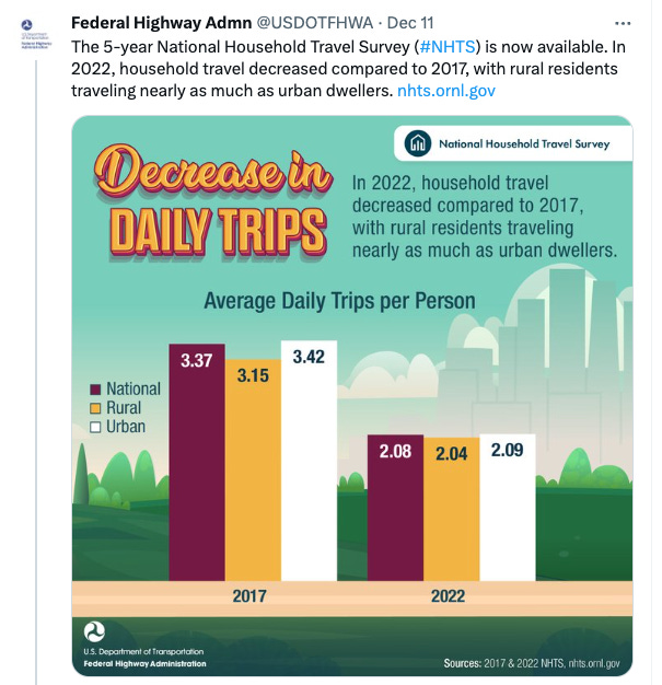
A deeper look, however, shows that this decline is not really due to people making fewer trips. It is, in fact, because the survey’s question methods changed, from a asking participants to fill out a travel diary to relying on their recollections of trips instead. This makes for a much more uncertain way of understanding travel behavior, and a method change makes comparisons to previous years very difficult.
(Unrelated) cool things
1,001 Novels: A Library of America - a wonderful project of mapping US literature and stories to different regions of the country
Nearby Wiki - a map website that lets you explore Wikipedia pages by their location 🗺
Thanks for reading!